How to create a dashboard from your Airtable base
Airtable offers robust data organization capabilities, but may lack the advanced data visualization features many of us are looking for. This is where GRID steps in to bridge the gap. GRID empowers you to create stunning visualizations and dynamic dashboards from your Airtable bases, and by connecting your Airtable base to GRID, you can unlock an entirely new level of visual representation for your data.
GRID allows for the effortless integration of your Airtable data with other platforms like Google Sheets, Excel, and Notion, and greatly expands your possibilities for data analysis and visualization.
In this blog post, we'll show you how to create a dashboard from Airtable using GRID.
Connecting your Airtable base
First, you’ll need to connect your Airtable account to GRID. It’s a simple 3 step process:
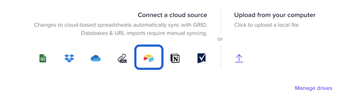
1. Create a new document and choose ‘Add existing data’. Then click the Airtable icon.
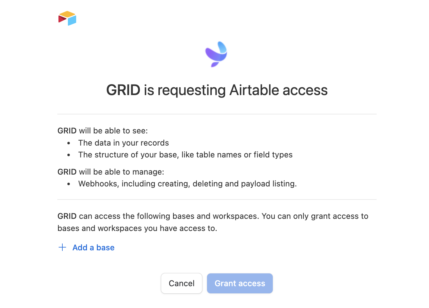
2. Next, click ‘Add base’ and find the base/s you want to connect to GRID. Click ‘Grant access’.
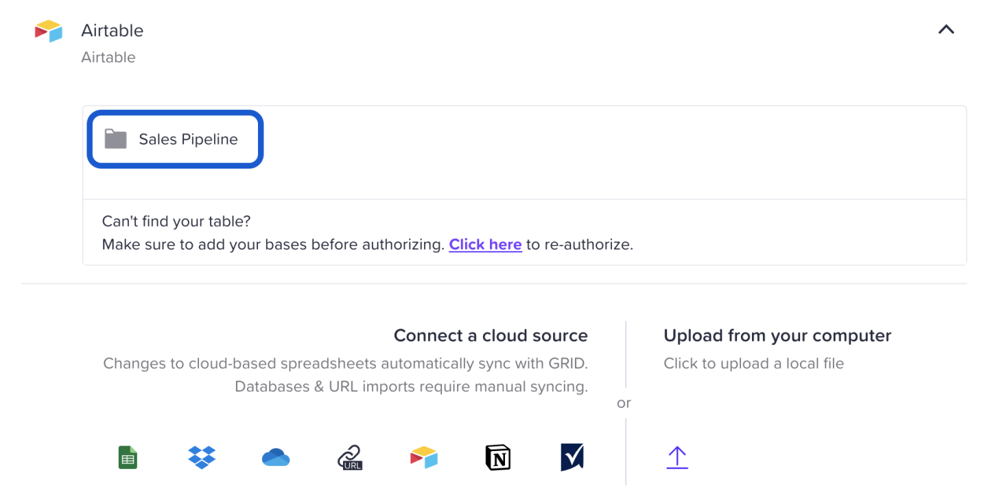
3. Now choose the base you want to use and it will appear in the data panel in your GRID document.
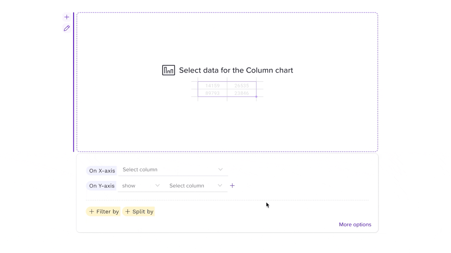
An easy way to quickly create & format a visualization directly from your Airtable bases is to use our Chart Builder. You’ll be offered the option to use the chart builder when you connect your Airtable base to GRID. Once activated, the chart builder will be visible in the bottom right corner of the data panel or when you create a column, line, bar or pie chart.
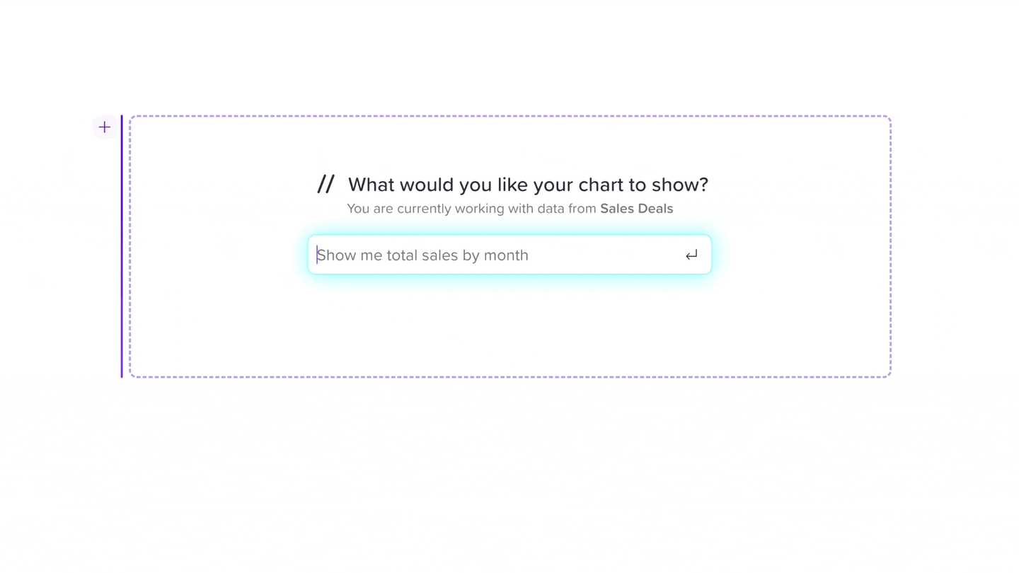
Our AI Chart Assistant is another fantastic option for creating visualizations from your Airtable bases. This feature can be found in the right corner of the spreadsheet panel once you’ve connected your base. Simply describe your requirements for the chart, and the chart assistant will create it for you.
Building your dashboard
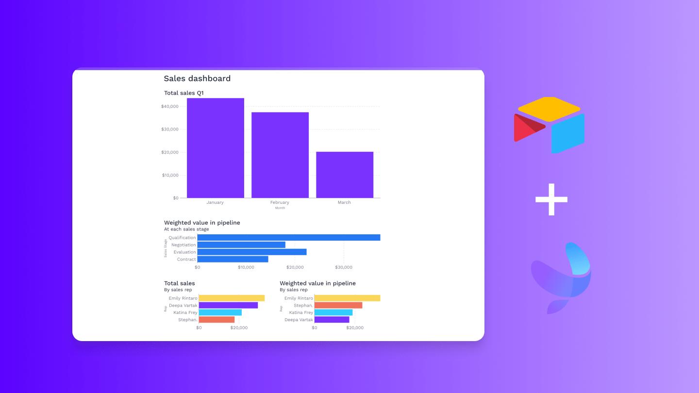
Now that we've established a connection to an Airtable base, we can proceed with creating our sales dashboard. You can access the sample Airtable base we used here and the GRID document here.
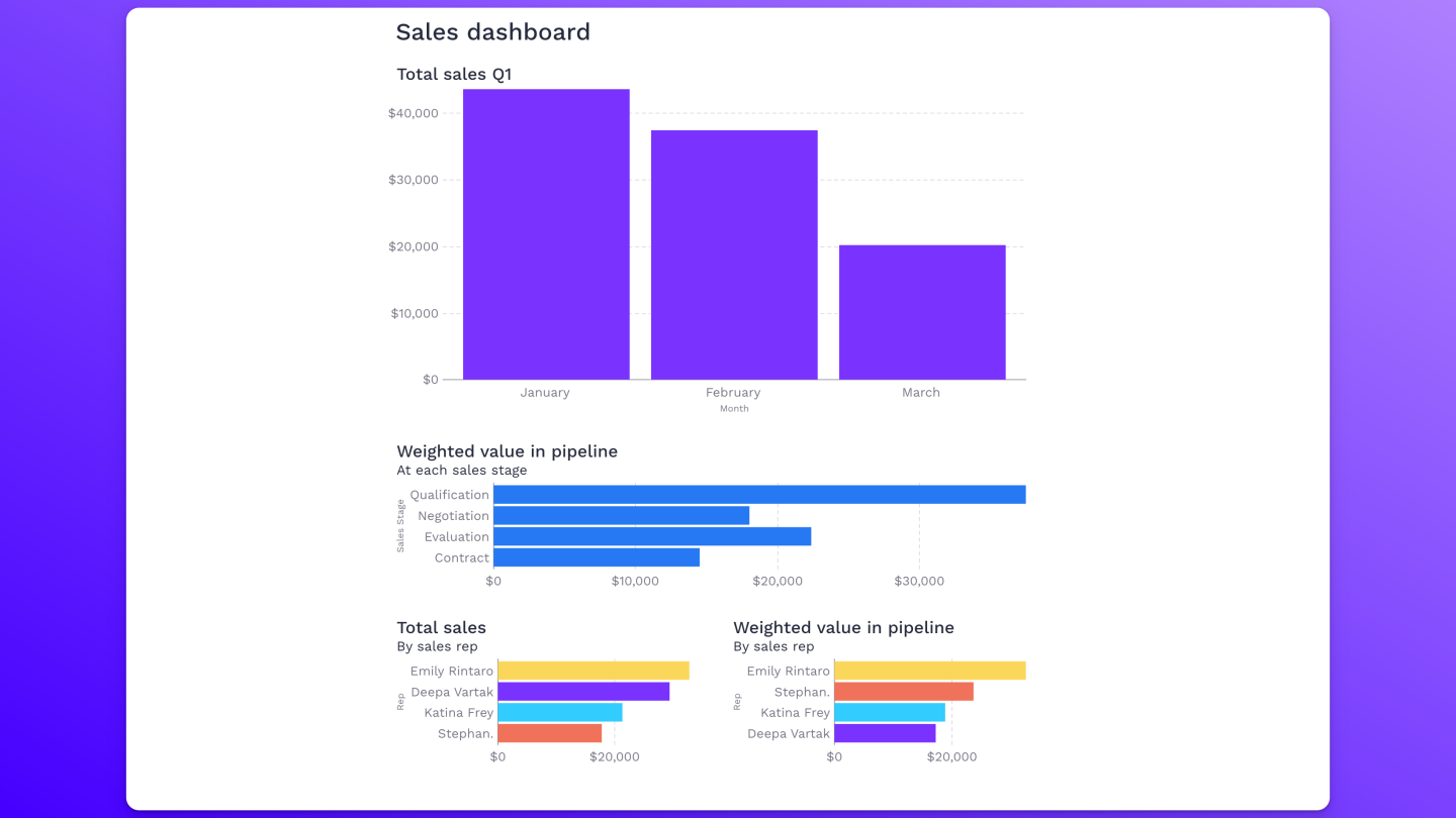
The dashboard we’re building will consist of four charts that provide the following information:
Total sales this quarter shown by month
Weighted deals value in pipeline
Total sales by each sales rep
Weighted deals value of each sales rep
Let's start with the first chart – a column chart displaying total sales in Q1. To create this chart, we utilized a helper column that provides the respective month number for easy filtering. In the chart builder, select ‘Month’ for the X-axis, and choose ‘sum’ and ‘Signed contract value’ for the Y-axis. You can further customize the chart by adding a title, changing its colors, or adjusting the sort order. Simply click ‘More options’ in the bottom right corner of the chart builder. To change the X-axis labels from 1, 2, 3 go to the X-axis labels settings and write ={"January","February","March"}.
Tip: To access the editor panel, just double-click on the chart.
Our second chart will be a bar chart, used to display the weighted value in each sales stage. This value is determined by multiplying the forecasted value by the percentage of likelihood that the deal will go through. Set the Y-axis to ‘Sales stage’ and the X-axis to ‘sum’ of ‘Weighted forecasted value’.
To exclude closed deals from the chart, apply a filter by selecting ‘Sales stage’ as the column. Choose "=! (is not)" followed by ‘Closed-won’ and another filter followed by ‘Closed-lost’.
We want our remaining charts to be displayed side by side. To achieve this, we’ll insert a column element from the Insert menu and format it accordingly.
Let’s create the next chart using the chart assistant. Click on Chart builder in the bottom right corner of the data panel, then select Chart assistant. Type in "Total sales by sales rep" and a chart illustrating the total sales for each representative will appear.
To complete your sales dashboard, we’re going to create a final chart displaying the weighted value in the pipeline for each sales representative. You can use either the chart assistant or the chart builder for this task.
Congrats! You’ve successfully created your sales dashboard 👏 Feel free to explore additional information from the sample Airtable base or continue to create charts from your own data.
If you'd like to learn more about the Chart Builder and Chart Assistant, we recommend checking out this short tutorial.
And if you haven’t yet, sign up for GRID and start visualising your Airtable bases.